3 Strength Indicators for Assessing Stock Momentum

When a stock changes course, how can you decide if it's just a blip or the start of something big?
Technical traders use a variety of trend indicators to help gauge a stock's strength, spot potential reversals, and ride out trends with confidence. Here are three such indicators—and how they're used.
1. Relative strength index (RSI)
A stock's RSI measures the speed and magnitude of its recent price changes, which can help determine whether it might be overbought or oversold and therefore potentially ready for a reversal.
RSI can be calculated using any time frame, but traders often measure a stock's price movement over the past 14 trading days, because it's sensitive enough to capture short-term price swings but not so sensitive that it will pick up too much noise.
Measured on a scale of 0 to 100, RSI typically respects the following boundaries:
- Below 30 may indicate the stock is oversold and could soon rebound.
- Above 70 may indicate the stock is overbought and could soon decline.
That said, some stocks operate in narrower or wider RSI ranges, so it's important for traders to determine a stock's customary range to inform a trade.
Additionally, an RSI reading may remain overbought or oversold for long periods, so traders often wait until the RSI crosses back below or above those levels, respectively, before placing a trade.
Traders will also look for divergences—when the stock's price and its RSI move in opposite directions—as well as corroborating signals from other indicators, such as ADX, to confirm a potential reversal.
RSI in action
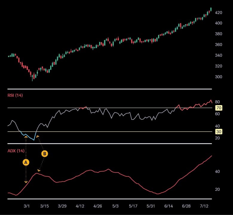
🅐 The stock's RSI dips below 30, indicating a potential trend reversal—which may be considered corroborated when the stock's ADX surpasses 20 and moves sharply upward.
🅑 The stock begins an upward trend as its RSI crosses above 30 and its ADX nears 40, suggesting a potential for sustained momentum.

Source: thinkorswim® desktop platform.
2. Moving average convergence/divergence (MACD)
MACD is used to assess the power of a stock's price movement by subtracting its 26-day exponential moving average (EMA) from its 12-day EMA. When the difference is:
- Greater than zero, the short-term trend is considered stronger than the long-term trend, which may indicate upward momentum.
- Less than zero, the long-term trend is typically seen as stronger than the short-term trend, which may indicate downward momentum.
However, MACD is most often used in combination with its signal line—the nine-day EMA of the MACD—to help spot weakening trends and possible reversals. When a stock's MACD crosses above or below the signal line (i.e., convergence), that's typically interpreted as a potential buy or sell signal, respectively.
The farther away the MACD moves from its signal (i.e., divergence), the stronger the momentum—but if this distance widens too much, it could indicate a potential reversal.
MACD in action
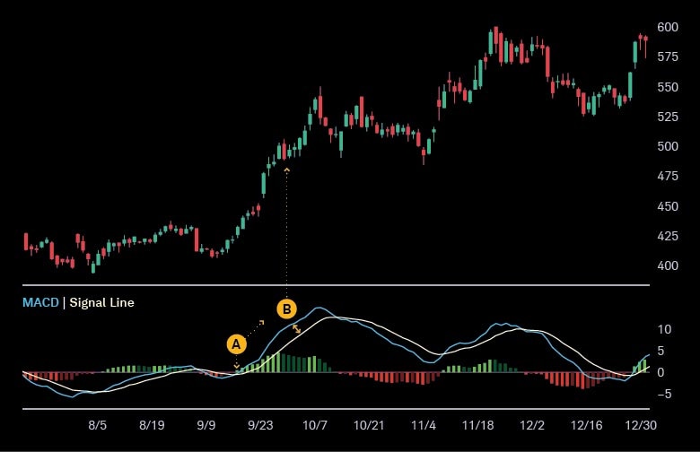
🅐 The stock's MACD line converges with its signal line and then moves higher, seen as suggesting accelerating upward momentum.
🅑 The MACD and signal line continue to diverge, interpreted as signaling even stronger momentum.

Source: thinkorswim desktop platform.
3. Average directional index (ADX)
ADX measures the strength of a stock's or an index's price movement, which helps traders determine whether a trend is forming, underway, or has the potential to reverse.
ADX readings are on a scale of 0 to 100 and are calculated using the average negative or positive price movement over a given period—typically 14 days. When a stock's ADX is:
- Below 20, it generally is interpreted as a nontrending or sideways market, during which range-bound strategies—in which traders buy at the support trend line and sell at the resistance trend line—are likely to be most interesting to traders.
- Above 20 and moving toward 25, this could be seen by traders as an entry point—especially if it coincides with corroborating signals, such as a price breakout above a moving average.
- Above 25, the trend is typically interpreted as strong. If it's over 40, it's often seen as very strong—and if it keeps moving higher, it might indicate that the stock may soon peak. Conversely, when the ADX dips back below 25, it may be seen by traders as a time to exit the trade.
ADX in action
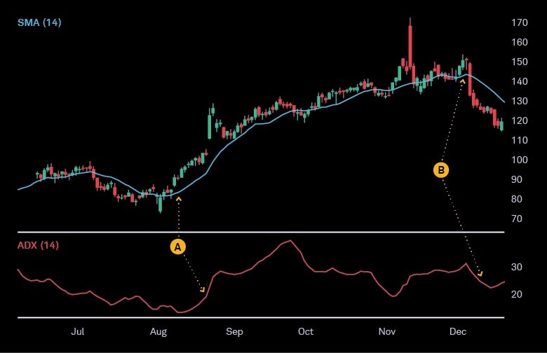
🅐 A stock's ADX rises above 25, suggesting a strong trend—which traders commonly see as corroborated when its price breaks above its 14-day simple moving average (SMA).
🅑 The stock later experiences a trend reversal, which is seen as confirmed when its ADX falls below 25 and its price makes lower lows below its SMA.

Source: thinkorswim desktop platform.
Pieces of a puzzle
As with most technical analyses, each of these indicators can provide a clue—not the complete answer. While RSI, MACD, and ADX values can help gauge a trend's strength, they may be more informative when combined with other confirming signals. Plus, traders often watch for signs of trend exhaustion—such as weakening volume—that could lead to a reversal, and consider the bigger picture, such as whether the broader market is trending in the same direction.
Trading momentum with confidence begins by layering multiple data points and following a strong exit discipline.
To view RSI, MACD, ADX, or corroborating signals for your selected stocks, log in to the thinkorswim® desktop platform:
- Select Charts and enter the stock symbol
- Select Studies, then Edit Studies . . .
- In the Edit Studies and Strategies window, search for your desired indicators and double-click to add them. To customize your indicator settings, click the gear icon and select OK.
Discover more from Onward

Keep reading the latest issue online or view the print edition.