How to Read Stock Charts and Trading Patterns
Examining price charts is a great way to learn about stock price behavior. Fundamental analysts use them to pinpoint inflection points tied to past events, while technical traders rely on price charts to identify entry and exit points.
Reading a price chart is the first skill a technical trader should learn. The movements of an asset's price over time shows how the effects of supply and demand play out.
At first, it's easy to become overwhelmed with the many looks and uses of technical analysis and charting.
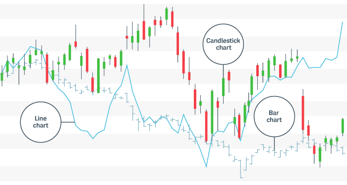
Here, we'll simplify things by narrowing the choices down to the three most common chart types: line, bar, and candlestick. Then we'll examine some of the more popular techniques that traders apply.
Types of trading charts and how to analyze them
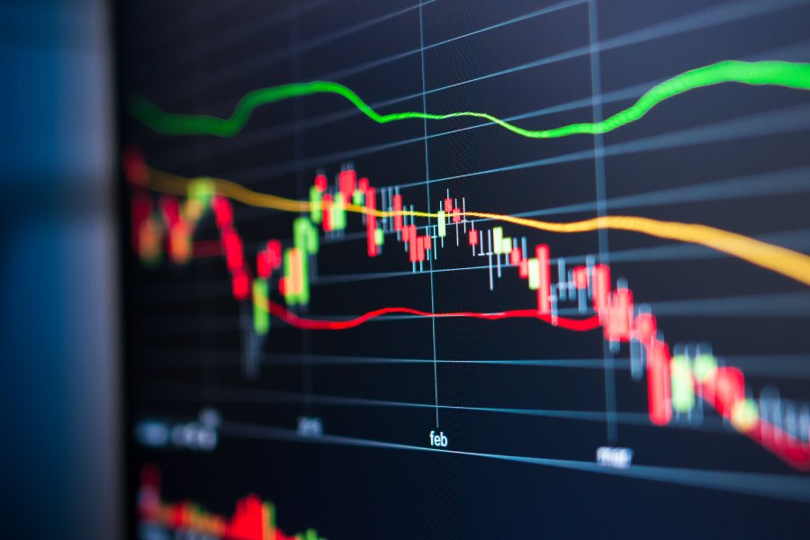
Price charts visualize the trading activity that takes place during a single trading period (whether it's five minutes, 30 minutes, one day, and so on). Generally speaking, each period consists of several data points, including the opening, high, low, and/or closing prices. When reading stock charts, traders typically use one or more of the three types—line, bar, and candlestick.
Three types of stock charts
For illustrative purposes only.
Line chart
Perhaps the most basic price chart is the line chart. It plots a single line that connects all closing prices of a stock for a certain time interval, giving traders a quick assessment of trends.
It's simple to follow, but the line chart may not tell traders much about each day's activity. It will, however, help traders see trends easily and visually compare the closing price from one period to the next.
Bar chart
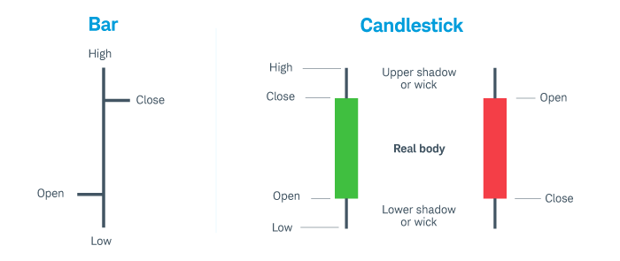
The bar chart is another way to chart price activity. Each bar shows the high, low, open, and close price for a given time period.
Bar charts help traders see the price range of each period. Bars may increase or decrease in size from one bar to the next or over a range of bars. Notice how the bars expand and contract between periods of high and low volatility. As the market becomes increasingly volatile, the bars become larger and the price swings further. As the market becomes quieter, the price typically contracts into smaller bars.
The fluctuation in bar size is because of the way each bar is constructed. The vertical height of the bar reflects the range between the high and low price of the bar period. The price bar also records the period's opening and closing prices with attached horizontal lines; the left line represents the open, and the right line represents the close.
Candlestick chart
The candlestick chart is a variation of the bar chart, but it offers traders more information. Candles help visualize bullish or bearish sentiment by displaying distinctive "bodies" that are green or red, depending on whether the stock closes higher or lower than the open. The body represents the range between the opening and closing prices of the time intervals; the high and low prices are called the wick or shadow (see the chart below).
Candles help analysts see how prices move in a trending market. In a normal bull market, there might be more clusters of green candles than red candles, while the reverse is true for a bear market. Certain combinations of candles create patterns that traders may use as entry or exit signals.
Bar charts vs. candlestick charts
For illustrative purposes only. Past performance does not guarantee future results.
Stock chart patterns for traders
It's one thing to know what a chart is; it's another to actually know how to read it.
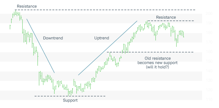
As shown in the chart below, stocks that move up over a period of time with a series of higher highs and higher lows are considered to be in uptrends; stocks that move down with lower highs and lower lows over a period of time are in downtrends.
Spotting trends, support, and resistance
For illustrative purposes only. Past performance does not guarantee future results.
Support is essentially a temporary floor for stock prices. It's a level where a stock trending down stops sinking and reverses course. At some point, the sellers stop selling, the buyers take control, and the stock starts rising again. At this inflection point, the stock's low price is identified as support, and it may remain in place until a new trend takes place.
After a rally, the stock may reverse course and come back down to test the support level. Breaking support would require high levels of selling volume so that the supply of shares on the market takes the price lower. If the selling volume isn't there and the stock does not penetrate support, the support level is considered strengthened. Short sellers will likely rethink their positions, while buyers will likely start to take control and help raise the share price.
Resistance is the exact opposite of support. It acts as a ceiling for stock prices at a point where a stock that is rallying stops moving higher and reverses course. Buyers will need more conviction to penetrate resistance levels in future rallies.
It's important to understand support and resistance are merely psychological levels, but they can, nevertheless, be useful for traders who are developing a trade plan.
Reversals and breakout patterns
Within a stock chart, certain repeatable patterns may appear that can provide clues to help determine where a new trend begins and ends. This means they also provide possible entry and exit points for trades.
For example, traders may look for at least two confirming stair steps in the opposite direction of the previous trend. If a stock has been trending down and suddenly reverses, before it can be called an uptrend (instead of merely a short bear market rally or "dead cat bounce"), look for confirmation in the chart pattern—at least one higher high than the first, and one higher low than the lowest price of the previous trend.
There are many breakout patterns that can provide useful entry and exit points. Ascending and descending triangles, bearish and bullish flags, and pennants are all common patterns traders use to generate buy and sell signals.
Common price patterns
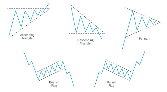
For illustrative purposes only. Past performance does not guarantee future results.
Multiple sources
Is the stock you're watching moving up or down? Who is doing the buying or selling? When is a good time to get into a trade? To answer these questions, technical traders typically use multiple indicators in combination.
One reason to do this is that individual indicators may provide false signals that could lead to poor entries and big losses. A more powerful system uses a combination of indicators to confirm one another. Traders are likely to stay out of potentially harmful trades more often if they wait for confirmation instead of relying on conflicting signals among indicators.
Where to start? Try learning how volume and moving averages work together with price action, and then add or subtract indicators as you develop your own system. Below is a good example of a daily chart that uses volume and moving averages, support and resistance levels, multiple indicators, and basic breakout patterns along with price action. It shows how traders might determine support and resistance levels (gray lines). The volume indicator is below the chart; two moving averages (10 day and 30 day) are drawn over the candles inside the chart. Note the crossover between the two moving averages, which may be a sign that momentum has shifted from bullish to bearish (or vice versa, as shown in the crossover at the left of the chart below).
Volume and moving averages work in tandem with prices
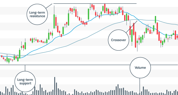
For illustrative purposes only. Past performance does not guarantee future results.
Bottom line
There are several different types of price charts traders can use to navigate the markets and an endless combination of indicators and methods with which to trade them.
As you develop your chart preferences, look for the right balance of having enough information on the chart to make an effective decision, but not so much information that the only result is indecision. Too few indicators can lead to false signals and poor choices, whereas too many can lead to "analysis paralysis" where no trading signal is ever given.