Time Travel: Choosing Stock Chart Time Frames
Any time you open a chart to analyze a stock, there are multiple time frames to choose from. How do you know which one to pick?
Generally, long-term traders and investors often favor daily charts to make decisions about when to buy or sell a stock, while active traders tend to use charts that track a stock's change in more detail, like every minute of the day. But stock charts with different time frames are useful to investors and more active traders alike.
Charts with shorter one- and five-minute time frames can potentially help you identify better entries or exits if you're a long-term investor. And if you're a short-term, more active trader, long-term charts can provide broader context for your decisions. We'll discuss both.
Identifying entries and exits with short-term charts
Let's say a long-term investor has developed a trade plan that includes investing in semiconductors, for example, an industry with many high-priced stocks. A longer time frame chart can help the investor decide if they want to buy. But even if they've made the decision, it can be tough to know exactly what price to enter at given the high cost—and every dollar counts.
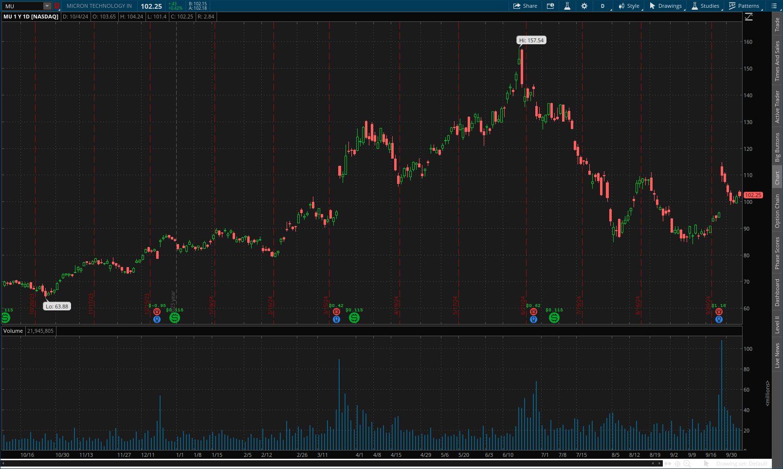
Consider Micron Technologies (MU)—and keep in mind, this is just an example and not a recommendation. If an investor opened a long-term stock price chart for Micron that showed the closing price for every day for a year, known as a one-year daily chart, they'd see the price rose from about $60 per share in October 2023 to almost $150 in August 2024. It then moved back down to below $100 in September 2024.
The investor's trade plan says to buy Micron if its price dips below $110 per share because they believe the stock might return to near its August highs. That'd mean the chart is indicating it might be a good time invest in Micron.
Micron Technologies one-year daily chart
Source: thinkorswim platform
But the company reported better-than-expected earnings on September 25, 2024, after the market closed, which caused a jump in the price to back above $100. On the one-year, daily chart, it appears the price on September 26 was $109.88, making it seem as though it may have been too late to catch the rise.
However, that's where a shorter time frame chart can make a difference in helping you see something you'd miss with a longer time frame. A chart that shows a stock's price in five-minute increments, for example, can help an investor gain more insight about price fluctuations that often happen after news events like earnings reports, which can cause big swings.
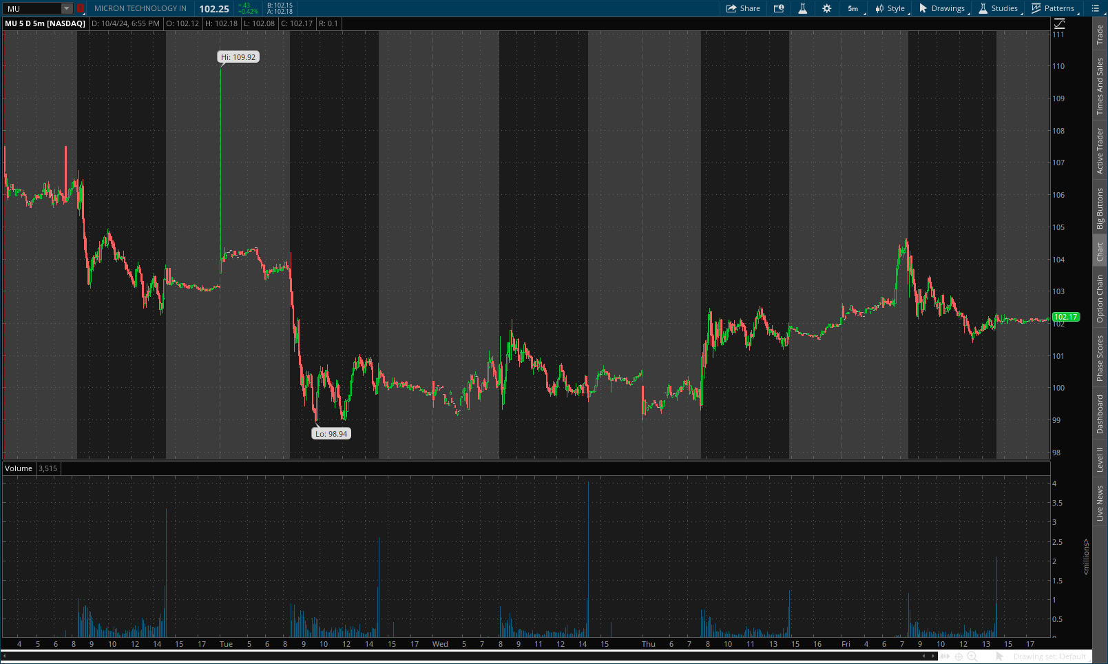
A five-minute chart for Micron on September 26, 2024, showed the stock's price actually fluctuated above and below $110 throughout the day.
Micron Technologies five-minute chart
Source: thinkorswim platform
While the earnings report may have led to a price rise on the open, it came back down as other investors sold to gain a little profit on the uptick. There was more volatility throughout the day.
If an investor's trade plan suggested buying when the price was below $110, the five-minute chart shows various opportunities as the stock fluctuated from the high of $114.80 and the low of $107.53.
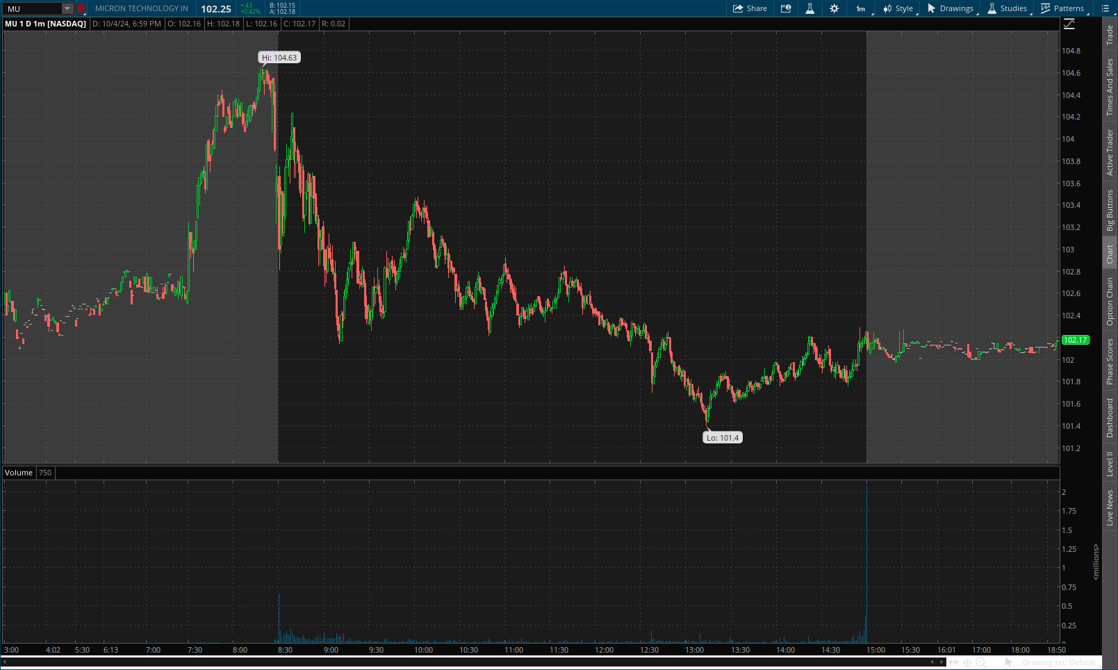
A one-minute chart shows more detail.
Micron Technologies one-minute chart
Source: thinkorswim platform
Micron's volatile day following the earnings news provided a lot of data for the investor to use, and a one-minute chart could allow them to develop support and resistance lines. The investor might notice a pattern of support developing around $108 throughout the day, while resistance appeared to be forming around $110. If their trade plan called for buying the stock at some point below $110, for example, they could use that support level as a buying point and make a purchase order to try to buy when it fell below $108, rather than buying at $114.80, the price the daily chart showed.
That better entry price might not be world changing, but it can add some additional profit if the thesis of their trade plan ends up working out.
However, it's vital to remember that it's easy to get caught up in the emotion of price swings when looking at short-term charts, so every investor should be judicious if they use one. It's impossible to time the market no matter how many technical or fundamental factors you study. That's why it's important to develop and stick to a trade plan, which can help ensure you enter orders correctly, can potentially help you manage risk, and can help you establish routines that fit your trading objectives.
While adding additional profit is great, it's important to not let the volatility and emotions associated with short-term charts distract you from your trade plan.
Also, keep in mind the importance of your chart's time frame settings. If you look at the 50-day moving average of a daily chart and switch the view from daily to weekly, the indicator will become a 50-week moving average. If you switch to a one-minute view, the indicator will become a 50-minute moving average.
Using long-term charts for context
Many active traders use shorter-time frame charts to make quick decisions throughout the day, but stepping back and looking at charts with broader time frames can provide valuable insight too.
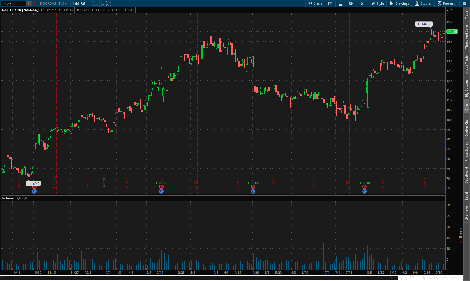
A one-year daily chart of DoorDash (DASH), for example, shows the company's stock going through what seems to be a temporary downtrend from April through July 2024, before continuing what appeared to be a broader uptrend that had been occurring throughout the past year.
DoorDash one-year daily chart
Source: thinkorswim platform
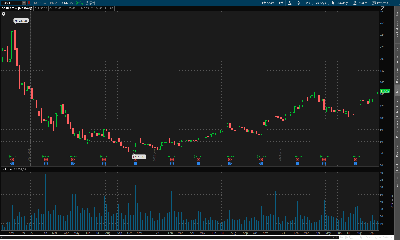
That downtrend might seem like an opportune time to buy for an investor whose trade plan calls for buying into the commerce industry at some kind of low. However, looking at a longer-term weekly chart of the company's stock over the past three years shows the stock went through a steep downtrend at the end of 2021.
DoorDash three-year weekly chart
Source: thinkorswim platform
The additional long-term context shows the stock had been in a steep downtrend from a high of more than $250 in late 2021 to a low of $41.37 in early 2022. Throughout 2023 and 2024, the price has trended upward, with a few dips lower and a recent rise to $144.86.
Within the company's broader trend, the recent rise isn't as dramatic. It points out that any investor or trader should make sure they don't only make their decisions using charts but also rely on a company's financial statements and other fundamentals that should have informed an investor's trade plan.
Bottom line
Changing the time frame on your charts can help you identify entry and exit points, give you new perspectives on how trends are playing out that can inform your understanding of overall trends, and point out the importance of developing a trade plan and sticking to it.
While using charts with different time frames can provide interesting insight, it's important to remember that shorter-time frames show lots of volatility, which can have a big emotional impact. Any trader considering using different time frames together should first experiment with them in the thinkorswim paperMoney® platform, which can help you see how they work within your trade plan without risking any real money.
To learn more about technical analysis, listen to Schwab's coaching webcasts.